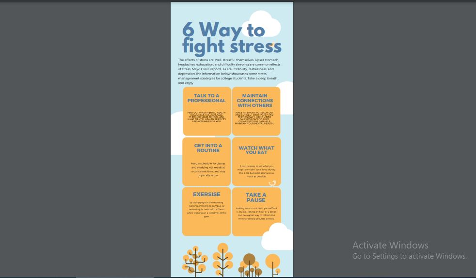
Above you can see my hands on activity with Canva.
I tried to have the following design theories in mind.
Be learner centered, goal oriented, real word performance, with data as heart of the process and outcome in mind.
What makes infographics effective:
- Informational Honesty
- Legibility and simple font
- Simple illustrations
- Limit colors
- Interactive elements and not tiny font


nickmaedel
2021-12-02 — 7:00 pm
Hi Mahi, thanks for sharing your infographic. At first glance, it is very appealing to the eye and has a very nice colour scheme and layout. My only recommendation would be to make sure that the text within the sections is centred, to ensure that it is symmetrical across the whole poster. Great work!